YU·LIBRARY
羽 · 圖 書 館 °
-
Mountains of books, depths of knowledge
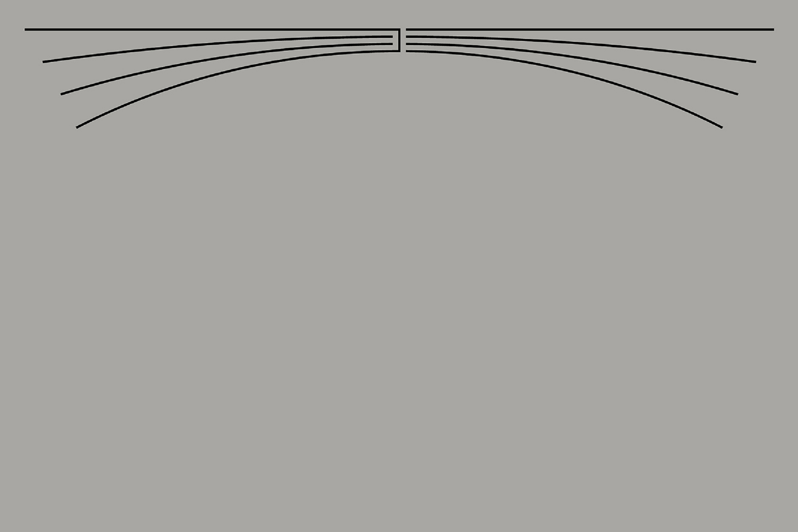
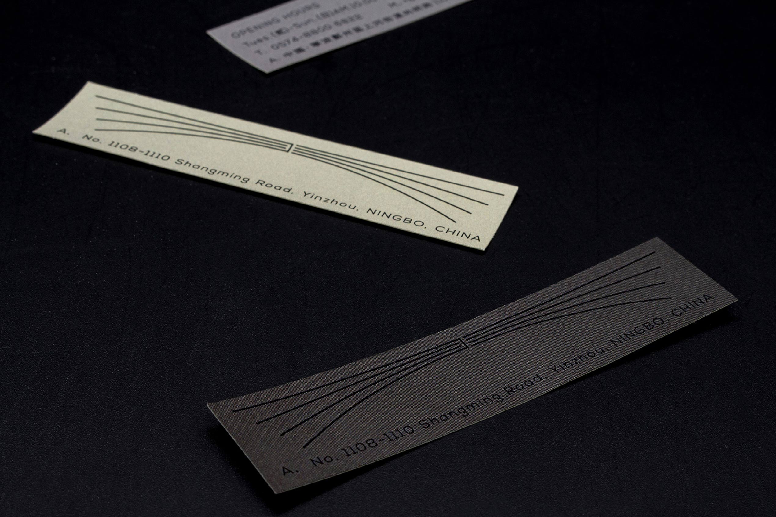
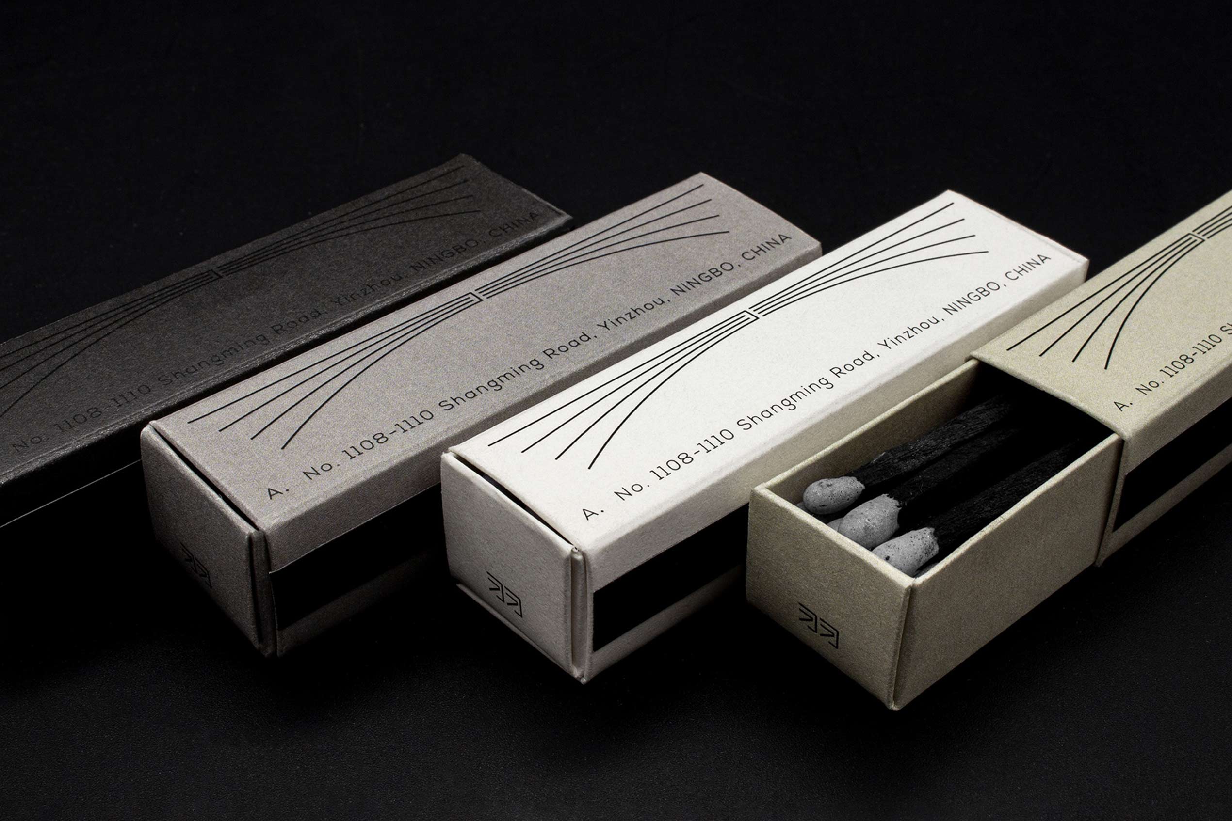
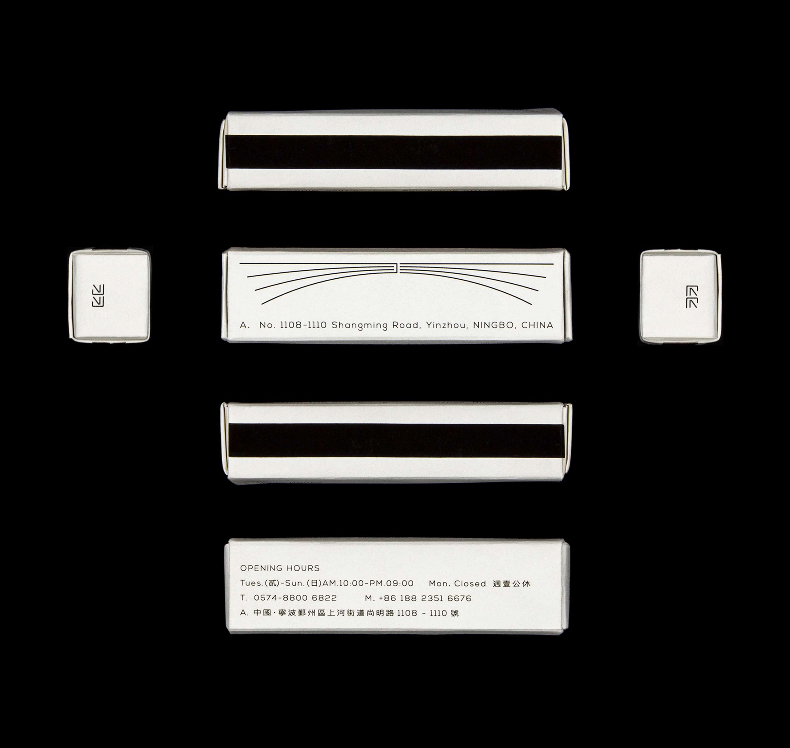
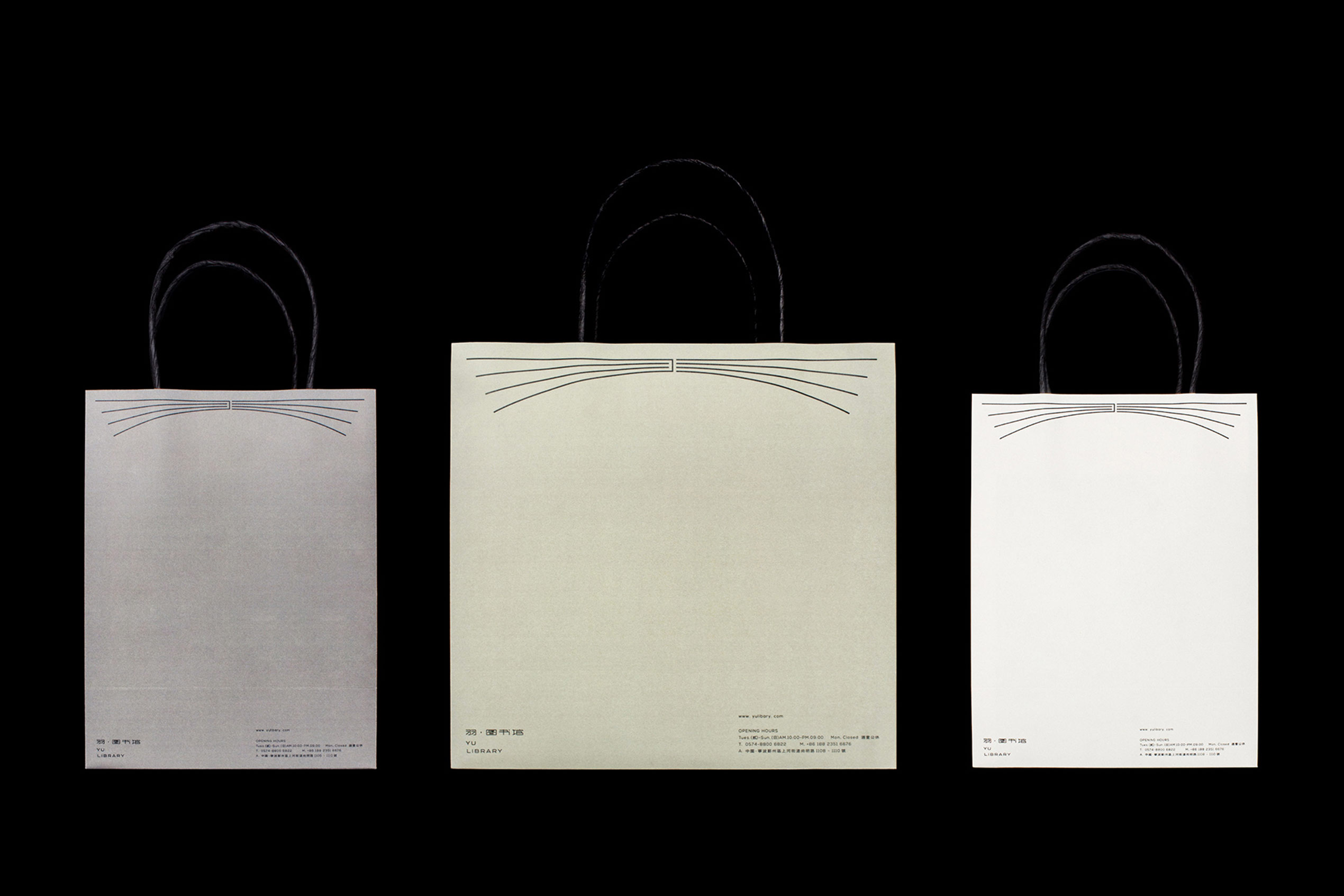
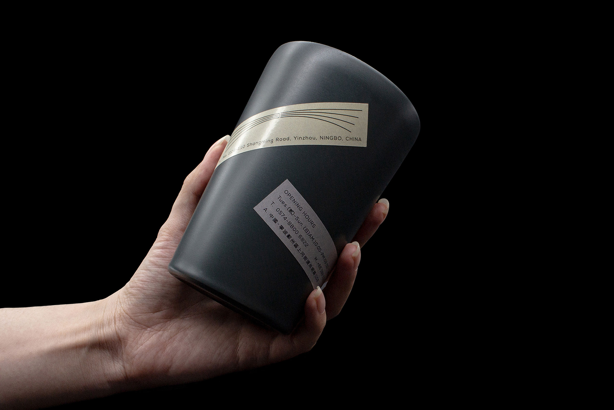
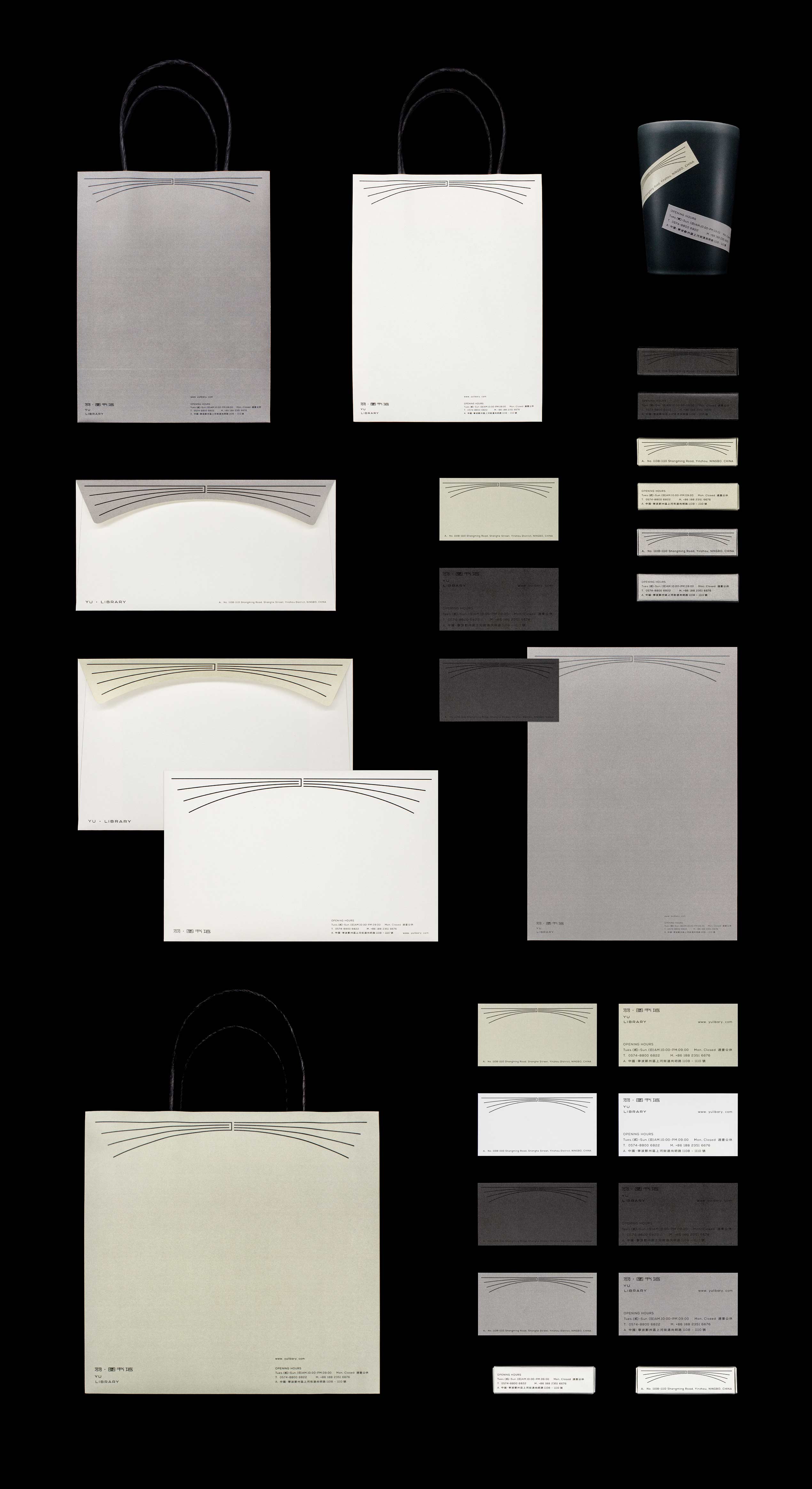
Upon first hearing the brand name, we pictured lightness and freedom. Therefore, our design aims to convey a straightforward feeling to users: soaring and wandering freely amid the sky of books.The logo graphic is transformed from the Chinese character "Yu" (Feather). Derived from this character, the full, powerful outstretched wings evoke the sensation of gliding endlessly through the sky, just as one roams freely within knowledge.
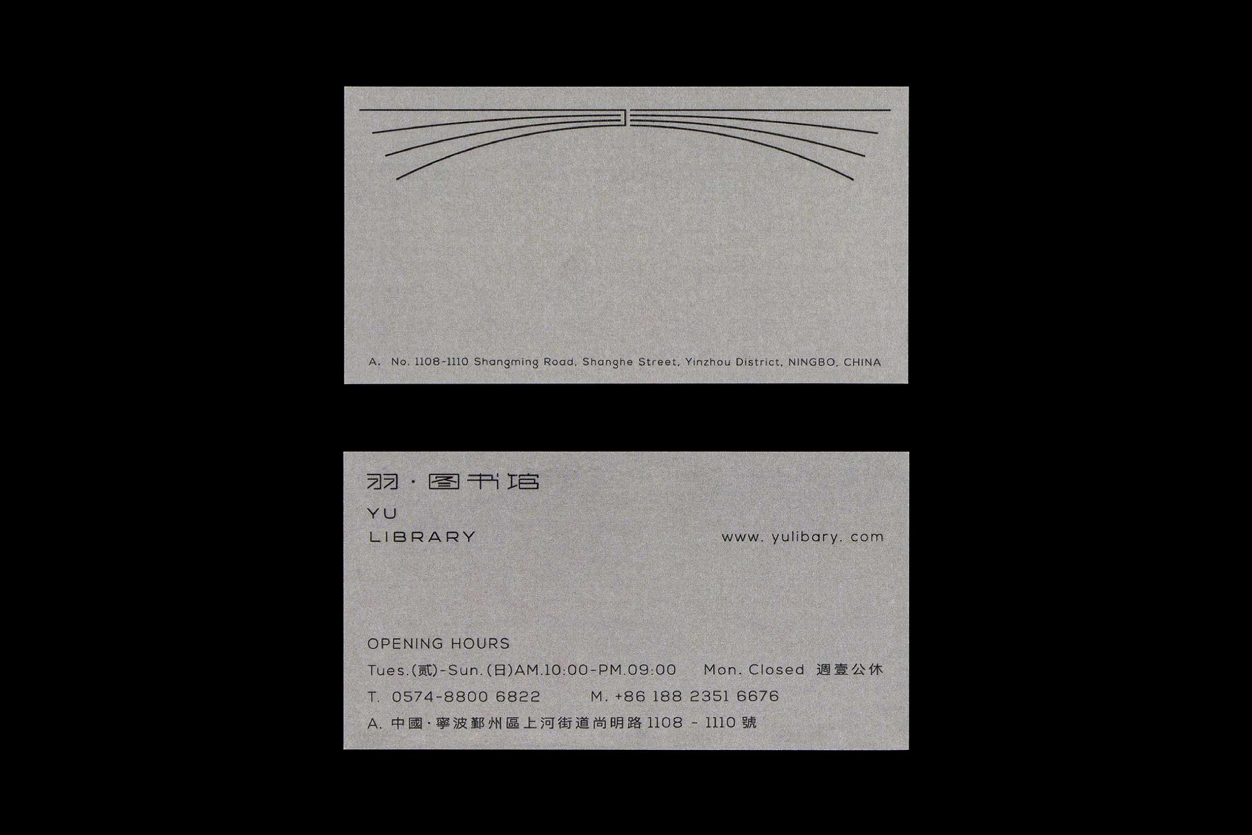
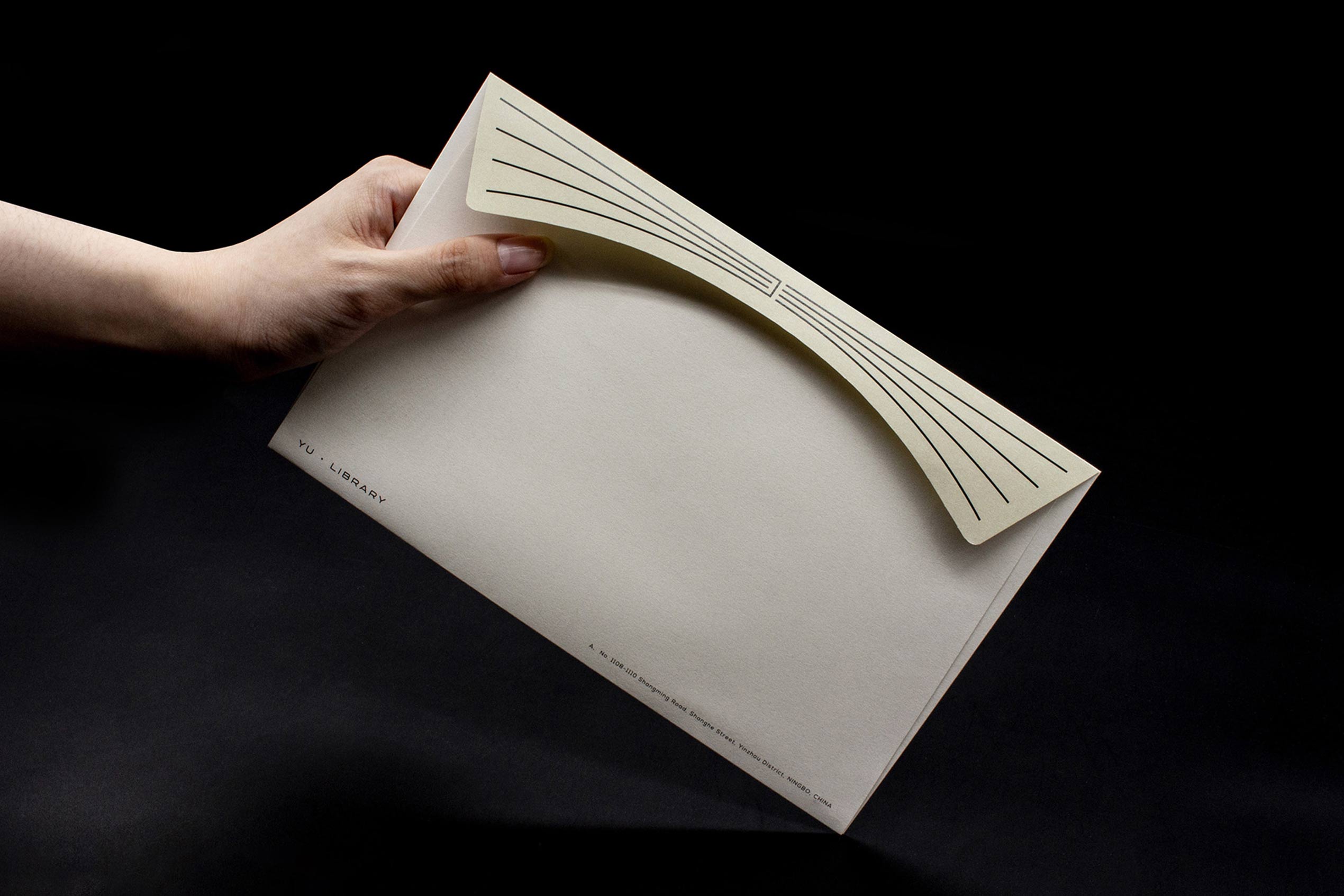
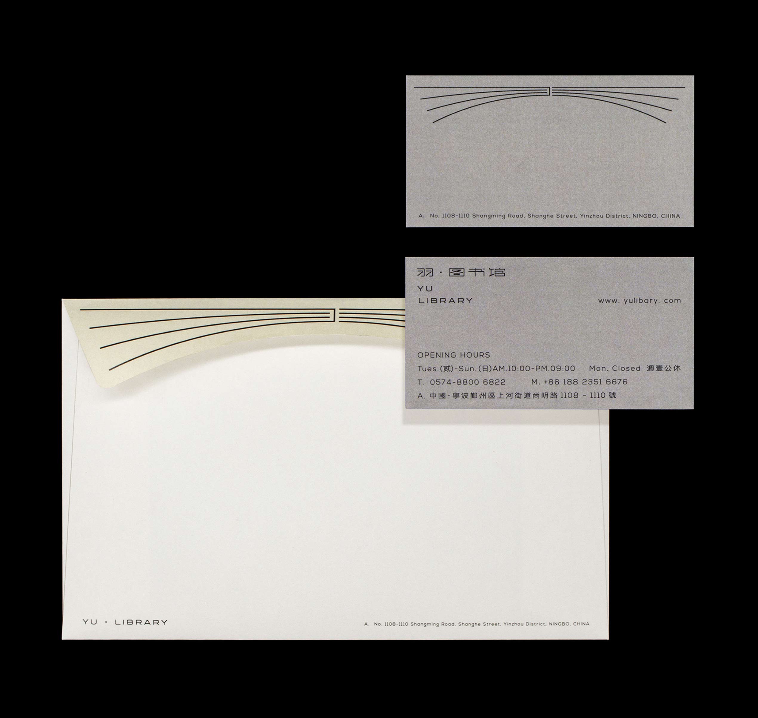
The logo also takes the shape of an open book, clearly embodying the identity of a library. Between its fluttering pages, it builds a bridge to wisdom.
Pursue in-depth reflection upward; accumulate and transform profoundly downward.
-
書山之高 學海之深
第一次聽到品牌名時,我們腦海中勾勒的畫面是輕盈的、自在的。因此,我們希望能從設計中傳遞給用戶最為直接的東西:在書的天空中自由飛翔,徜徉。
LOGO圖形從中文「羽」字變形而來。從「羽」出發,張開的羽翼豐滿富有力量、不斷翱翔在天空中的翅膀,如同在知識中漫遊。LOGO更是徐徐翻開的「書本」,明確表達了圖書館的屬性,在翻飛的書頁里為知識構建「橋梁」。
向上思辨研究,向下沉淀蛻變。